
Images Source: Pantone.
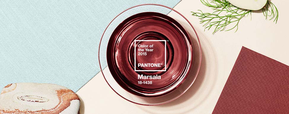
Global cultural uniformity derives from marketing decisions which dictate the aesthetics of our lives. One such decision is the colour of the year, determined by New Jersey corporation Pantone, which tells all interior, events, makeup and clothing designers what palettes to use in the coming months. 2015's hue sits somewhere between cacao nibs and oxblood and is called 'Marsala.' Pantone has been choosing the colour of the year since 2000. You can see a video (here) of Pantone executive director Leatrice Eiseman describing why Marsala was chosen, mainly to answer a 'public need for nurturing and earthy rootedness.'

2014's colour: Radiant Orchid. Image Source: Pantone.

2014's Radiant Orchid palette supposedly drew from Indian influences. In fact, this purple palette is not typical of many Indian regional traditional palettes: see here, here, here, here, here, here, here and here. Image Source: Indian Wedding Site.

Image Source: Lamps Plus.
Last year's colour was 'Radiant Orchid.' In December 2013, polls greeted Radiant Orchid with mixed results. One poll respondent commented: "Let's just say subtlety is not Pantone's strong suit. No interest in using either of [Radiant Orchid or the 2013 colour of the year, Emerald Green]." And another: "How do they determine the color of the year? It never seems to be that popular in the Midwest. I remember a few years ago honeysuckle was the color of the year. So I stocked my store with honey colored accessories. Had to clearance them out. :)" Yet another: "Not a nice color. Can't imagine where I would use it." Another: "I'd like to be part of the panel that picks these 'color(s) of the year'. It appears the criteria include ... 'what is the craziest thing we can come up to see how many sheep follow us over the cliff.' In my mind, the color of the year should be one that is either (1) a color most used in the paint industry or (2) an innovative but usable combination for the majority of the populace. I realize that home décor colors typically follow fashion trends but I'm not quite ready to 'wear' my clothes on my walls."

Marsala is a few steps away from Radiant Orchid, so we have the subtle shift from "expressive, exotic" subcontinental fuchsia to wine-laden Mediterranean commercial sensibilities. Think: decadent Hispanian Roman Empire, with a fox head mask thrown in for good measure. The news outlets report on the new colour, and the shops line up to deliver clothes, paints, toys, rugs and other designer goodies for consumers to buy. Yes, ladies, this means you will be expected to buy and wear grey nail polish with Russian names.

Image Source: Sourceable.
Pantone turns the colour wheel every year. This is one way in which the global economy absorbs traditional cultures and pressures the world's citizens into continued, unbroken, unquestioned consumption, because if you want to keep up with the neighbours, you have to change the colour of everything you own on an annual basis. If you want to understand the heavy duty technology that pours into the decisions around industrial colour and arts, see reports here, here and here.

A 1917 four-way color circle related to the color opponent process. Notice that the process for determining opposition in colour and the making of secondary and tertiary colours bears a resemblance to the competition between four elements in Aristotelian physics and to the elemental conflict symbolized by the Native American medicine wheel and the Celtic cross, suggesting that colour theory may have spiritual, mystical and occult dimensions. Image Source: Wiki.


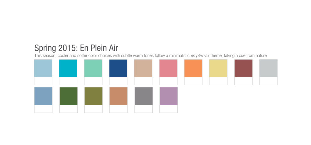
The choice for colour of the year also decides other trending colours, since Marsala has to be matched by its accompanying palettes (here). Expect the spring palette En Plein Air to offer a lot of funny pale versions and complements of Marsala - very pastel wine shades, apricots, corals and turquoises. Ordering the upcoming palettes for 2015 and 2016 is quite expensive, but you can't be in a commercial creative enterprise without knowing the decided trends. It looks like Marsala will dissolve in 2016, morphing into three cousins of green, red-purple and orange.


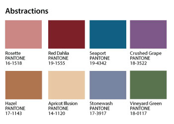
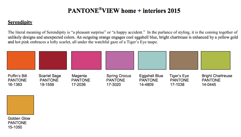
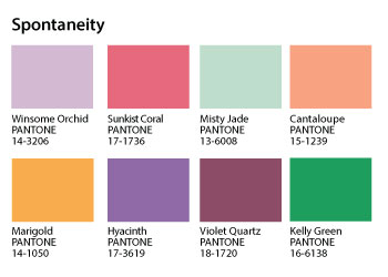
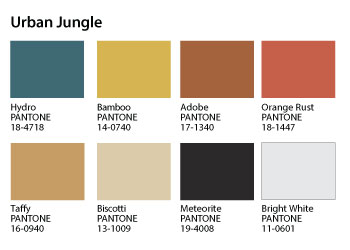
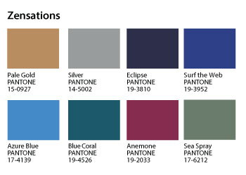
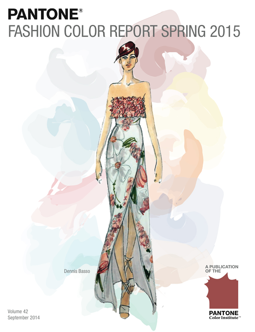
Among the many influencers and designers who discuss Marsala on the Pantone site, designer Dennis Basso expects to use blushy nudes, apricots, olive, avocado green, pale orange sherbet, cool pearl grey, charcoal, ivory and dusty rose. His inspiration in putting Marsala into action is: "International resorts and women in the '60s." That makes women's must-have item for spring 2015 a "strapless silk cloqué gown with hand-embroidered flowers in shades of Avocado and Cool Gray." There are nine Marsala-derived interior design palettes: Abstractions; Botanicum; Past Traces; Serendipity; Spontaneity; Style-Setting; Tinted Medley; Urban Jungle; and Zensations.

Image Source: Specialty Fabrics Review.

Pantone spring 2015 colour palette. Image Source: Photo Bucket.

Home interiors, spring 2015. Image Source: Design Confidential.

Women's spring 2015 fashions. Image Source: 3shahs.


Upholstery, 2015. Image Source: Design Threads.

Image Source: Fashion Trendsetter.


Dennis Basso designs for spring 2015. Images Source: tumblr and Getty Images.

En Plein Air palette for spring 2015. Image Source: Mazel Moments.

Gudy Herder: autumn/winter 2015-2016. Dusky Berry. Image Source: Eclectic Trends.

Fall/winter 2015-2016. Image Source: pinterest.

Autumn/winter, 2015-2016. Image Source: Dorly Designs.
Others, such as Barcelona-based stylist Gudy Herder, tried in October 2014 to predict the trends at the UK's Global Color Research for 2015-2016 and 2016-2017.

Spring Garden, 2016. Image Source: pinterest.

Spring/summer 2016: Kabuki. Image Source: pinterest.

Spring/summer 2016: Japanese Bloom. Image Source: mode information via pinterest.

Spring/summer 2016: Mystic Mandala. Image Source: pinterest.


2016-2017 Trend 1: Wonderland. "'Wonderland' describes cold, rough nordic landscapes. It evokes escapism and the desire to discover the inaccessible, the undiscovered. It is etherial, sometimes intangible. It draws major inspiration from the nordic nature and brings the feeling of nature into our lives and homes. It is the desire to liberate ourselves from the conventions and limits, it refers to our inner urge to cut off the strings that make us function in our mundane life. Elusive, frosty colors define this trend - think of cold whites, icy blues, dark greens but also opposing lava reds and other volcanic hues, soft sunset colors. " Image Source: Happy Interiors Blog and here and here.

2016-2017 Trend 2: Scanned. "This trend reveals what lies beneath. It triggers our explorative nature to peek under the surface, to see what lies beneath and thus to better understand life. It is a sort of creative Darwinism, an urge to understand, observe and control. It focuses on transparency and X-ray looks, it integrates technology in the human body and life. Even though it has a technological dimension, it is still airy, delicate. It is the poetic dimension of technology if you want so. Color wise think of charcoal, transparent greys, mauve, dusky blues and pale pink." Image Source: Happy Interiors Blog.


2016-2017 Trend 3: Collage. "Who knew - in two years the 80s will be back, in full force! This trend refers to the so-called 'Memphis Design', an Italian design and architecture group from 1981. It is a non-conformist approach and leverages our creative drive. Vivid colors, geometric shapes, modular concepts - it is a sort of cut & past style with lots of optimism and dynamics. It is all about customization and a modular understanding of design. Think of painterly effects, brush strokes, black & white with blush and peach hues, light blues, greys. Playful is a keyword here!" Image Source: Happy Interiors Blog and here.

2016-2017 Trend 4: Cosmic. "This trend evokes distant feelings, it is a technological, mechanical concept, rooting in the 80s. Imagine exploding stars, northern lights and a robot feeling. It is acid, vivid, full of drama, it melts, floats, it shimmers, it's metallic, it's crystalline. Color wise think of acid greens, vibrant pinks and purples, midnight blues, turquoise and black. Also think of shimmering gold and silver effects. With this trend we are bound to set off and explore the universe! After her presentation Gudy asked for feedback from the attending 25 lifestyle bloggers and the two favorite trend forecasts were 'Wonderland' and 'Scanned'. I think this was mostly because we can already see those in the creative world - their colors and landscape designs and X-ray looks are already being applied by forward thinking brands and most of it comes from Scandinavia." Image Source: Happy Interiors Blog.


Nice post.. Lovely Pics..
ReplyDeleteReally nice and use full post and beautifull Dress Collection
ReplyDeleteLovely and beautiful blog. pics are amazing.
ReplyDeleteGood work... innovative pics
ReplyDeleteLovely Pics collection..Everyone will fall in love with these.
ReplyDeleteLovely and beautiful blog. pics are amazing. Keep continue..
ReplyDelete